What better day to end the year then with a basic guide to colouring- This is for beginners or intermediate artists. Colouring is a big part to an art piece, whether you decide to use colours or not, that’s up to you, but for the most part, having some knowledge on appliance of colour will really help you out!
____________________________________________
ARTISTS WITH AN INSPIRING KNOWLEDGE OF COLOUR APPLICATION! Please take the time to have a look at other artists work so that you ca research and get inspired!
Gullacass:Uses brights, dulls and pastels to create brilliant guro, pop and macabre pieces| DA + TUMBLR
TinyCalcium:Old friend of mine who explores brights and mustard colours and places them as a foundation for their work | TUMBLR
BeastPop:Talented with opposing and Triwheel colours. Outstanding cell-shading, and knows how to flexibly bend colour form to their will in popart. | DA
H0stel:Fantastic composition of light direction and applies colour to bodies based on ambient occlusion. | TUMBLR
_____________________________________________
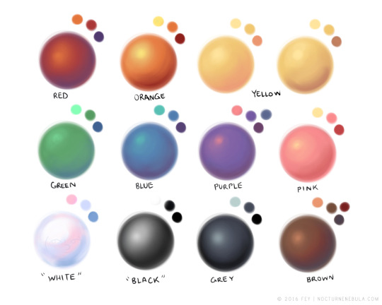
COLOUR SLANG: I use some strange slang to express colour types and shades as well as groups. Although they may not be canonically correct, I will use these terms to describe colour palates to the best of my ability!
Analogous: Colours that are near or adjacent to each other on the colour wheel, EG: Red and Orange
Oppositional/complimentary: Colours that are opposed or opposite from each other on the colour wheel, EG: Cherry and Green
Triadic: Colours that form a triangle on the Colour wheel, EG: Cyan, Magenta and Yellow. These three colours when mixed together will make black.
Arrowtype/Quadcolour: Four colours, that generally form an arrow shape on the colour wheel.
Tetradic: Colours that form a rectangle or square in the colour wheel
Neons: The very brightest you can get a colour, be careful where you use them as they can look ugly together at the most. Try to use neons when you are adding bright glowing objects to your piece. Neons are great for highlights.
Brights: Slightly washed Neons. Appropriate if you have characters that are colourful.
Washed: Very washed brights with a hint of grey. These are also useful for colourful characters.
Pastels: Colour with white in them to make them seem light.
Baby Pastel: Pastel with even more white in them, good for subtle highlights.
Darks: Colour with black added to them. Used mostly for lineart.
Mustards: Colours with dark grey added to them
Earthen: Colours with brown added to them
Warm and Cool colours: Warm colours are colours that range fromMagenta to Yellow. Cool ones range from Lime to Fuchsia.
Straight tones: A greyscale palate. or a straight scale of one colour from black to it’s neon form.
Warm and cool tones: Warm tones are a greyscale mixed with warm colours and cool tones are greyscale mixed with cool colours.
Skintones: Warm washed or pastel colours generally used to colour in skin, but they don’t have to be warm at all! ( I will not show you a palate for this however)
______________________________________________
WHAT TO AVOID WHEN COLOURING: beginner artists, tend to go ahead and start by colouring their line art with neon and mustard colours. Neons are not necessarily good for base colours unless the character has a glow.
I often see lazy attempts to shade, often a beginner artist with use an airbrush and use black and white to shade and highlight their piece. This is not very effective, and I’m sorry to say… It’s kind of gross as well. Try to avoid being lazy. If you have a piece that has bold black lines, avoid using soft shading and airbrushing at this point of time.
Black and white isn’t always the best option when colouring in your piece, but it also depends on the style you are trying to convey. If you plan on only using straight tones to colour in a piece, black and white is good.
A GOOD BASIC WAY TO COLOUR For this basic tutorial I will show you a nice way to colour in a piece with bold lines. I will be using Minty’s Classic character as an example.
Begin with using brights that have been washed down a little and washed skin tones if your character is human based. Avoid using neons or mustards if you are able. If there is white on the character, such as the white on an eyeball or the teeth, consider using baby pastels. For Minty’s eyeballs I have used a baby pastel blue. I have chosen to use a darker and more washed version for her Irises.
With you foundation colours placed down, use a washed warm colour for the skin tone, such as a salmon. If the character’s hair or fur is warm coloured, use a pink or red orange to shade that as well. Use the cell shading technique. This may mean you will have to erase some of your shading so be sure to do this on another layer. For your baby pastels, you can use a regular pastel to shade it. For Minty’s eyes I have used pastel blue and lowered the opacity by a little.
For Highlights, I have chosen to use baby pastel yellow. I wanted the piece to be warm.
Applying a light airbrush over the top of the piece makes it feel a little softer. I have also applied the airbrush over the initial borders to create colour bleed, giving a very subtle reflective approach.
Colouring your line art layer, particularly if you have bold lines, can really make a piece look more interesting! I like to leave the overall outline black. You can gradient and bleed colour in your line art as well
Light tracing is a technique lots of artist’s use, where they run a sharp line of highlight next to line art to divide borders.
This looks a lot nicer than the black and white shading, doesn’t it!? __________________________________________
This is a very very simple guide to applying colour to your piece! If This helped, please reblog and share this guide around!
If you have any questions or feedback, don’t be afraid to send me a message!
Y’know what’s funny about that question is that how I first made my OC barron started when I saw a paintbrush in my bedroom and thought, i’m gonna make that my OC. And making an OC in a cuphead fandom is great because there’s so many possibilities of what character designs to make.
Okay, so about the character designs, if you don’t want to be a copycat, you can always play with its designs, don’t limit yourself to one certain bodytype. Maybe it’s short or tall, thin or chubby, small or big, etc. It’s always modifiable. And also don’t go to overboard for the details of the designs, because it takes to much time and effort. Make it simple. And always pay attention to its color scheme. Now as an artist, I know that it takes awhile to really know what color, shading, tints, or hues to pick. I could tell you the basics, but I think there’s already a website about colorscheming, so please go check it out to learn.
To me, personality is the most important of all. It’s gotta be interesting and relatable. Don’t make a the character too perfect. Make it flawed. Sometimes, I’d like to think that even though this character is flawed in one area, it’s really great in another area. For example, although this person is very beautiful, they have a really bad attitude. Another example is that although this person if sweet and kind, they are very weak and sensitive. Flawed characters are interesting. Marysues, now there’s a character I will pay no mind to.
Now, this is very important. I kid you not, STICK TO YOUR CHARACTER’S PERSONALITY. I swear, I made a mistake with one OC of mine before, and I am ashamed(well not really i just really hated what I did to her character). When you introduce your OC with their personality and all, stick to it. Don’t change it. The only time you really change it is when some big event happens an in reacting to it the character changes in a different way. I wish I had known this before.
So that’s all that I’ll tell you. Hope this helps
Okay another thing:
This is optional, but I think it’s the best way to make the character, well more interesting. Don’t tell their so much of their background story to the audience. Maybe show glimpses through comics or fanfics, but when you first introduce your characters to the audience, don’t just pronounce their bg story already. It’s good to have a certain mystery and have the audience wonder what is going on in the person’s head. Why is he or she like this and why does he or she do the things they do. It makes them wonder, what happened to them that make them that way? But you don’t really need to do this. You can tell the audience about their bg story already, but I think it’s better this way. It’s how I made Barron to be. I bet you guys are wondering what’s goin on between the mystery lady and him amiright~?XD Haha. Man I hope to get to the comic soon. Anyways, yeah, do what you think is best.
i didn’t mean to make this so long but i wanted to both analyze my own style and give other people a look into it! I hope someone can find some use for it!
I made a thing! I was thinking about this for a few days – because I realized that when I was young, I was also frustrated about being given the same advice over and over – without really knowing what it meant!!
Here’s 5 techniques which I have done before which have helped me grow as an artist, which are good for 5-minute warmups or just straight up challenges for your sketchbook!
Obviously, these are not the ONLY techniques – they’re just the ones I find most fun! And maybe they’re not the most ‘correct’ ones out there, but it’s better than another comic about practicing more, right?
when you don’t do a warm up and go straight into lineart and your hand does the thing
Thats a sign of inflammation of the wrist called carpel tunnel . I had surgery because it got so bad I couldn’t draw anymore.
Yikes D8.
That’s why it’s so important to do stretches and draw with your whole arm (ok, arguably hard with a tablet versus a big gorgeous easel) and etc but I forgot today bc I am a moron and it was great
?????
people warm up to draw? like… how?
not an artists but climbing hand and lower arm exercises;
trying to find more and better diagrams for other stretches but yeah it’s super important if your gonna be using your arms a lot.
Adding this important video for all the artists out there, take care of your hands ♥
I jotted down for a friend of mine some tips and notes on how I approach drawing hair, and things I keep in mind while doing so, and thought I’d share. There are loads of other ways to do it, and the learning never stops, so I hope this helps!
Maybe none of these peeked your interest-maybe you’ve been wanting to create an o.c, but never really knew how to start-or you just enjoy making O.C’s….
This masterlist is to help you in making your own OCs….it can also apply to developing RP characters i suppose!(´ヮ`)!